The Challenge
In April 2020, the public needed to understand COVID-19 spread at the local level—but existing dashboards were either too complex for general audiences or too simplified to be useful. CMU's Delphi research group had the data; they needed ways to make it legible.
What I Built
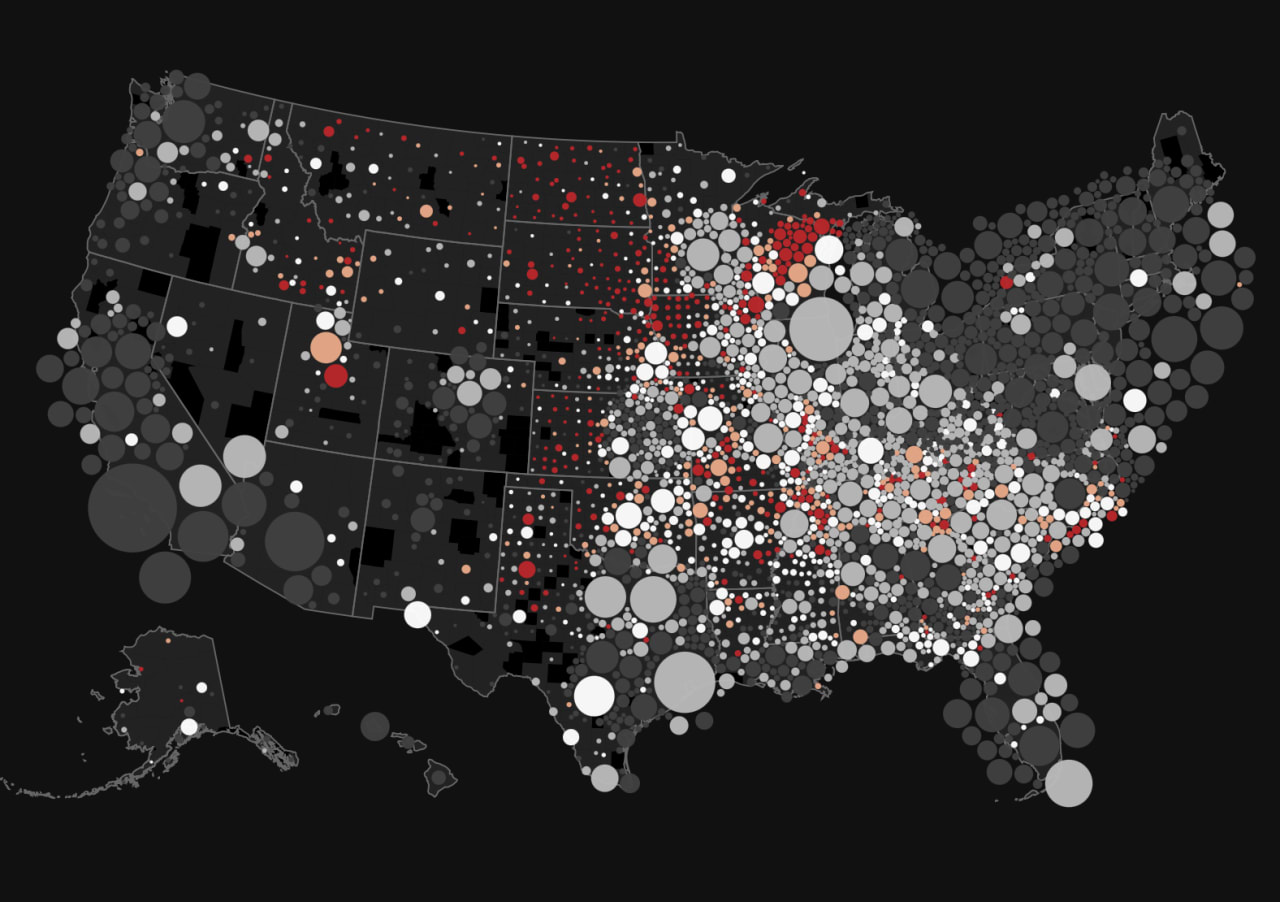
Prototyped interactive visualizations for CMU's COVIDcast project, exploring different approaches to showing hospitalization rates, transmission patterns, and movement data across U.S. counties.
Key explorations:
- Force-directed county bubbles sized by population, colored by case rates
- Time-series animations showing spread patterns
- Annotation-friendly layouts for public health communications
Technical Approach
Built exploratory prototypes on Observable, using D3's force simulation to create bubble layouts where each county is represented proportionally. Color scales mapped daily COVID cases per 100k population.
Context
Part of a broader effort during the early pandemic to help newsrooms and public health officials visualize uncertainty—work that also informed my OSET Institute collaboration on election data visualization.